 The use of conzept 16 applications on mobile devices is a recurring topic for which there are many different solutions. One interesting variant works by converting the Windows interface to HTML 5, allowing the application to run on any device with a current web browser. We have developed a new example for this.
Continued use of the designer
Mobile application development differs fundamentally from development for desktop systems. This is due to the handling and the differences in the available platform of the respective devices. Desktop systems have a larger output surface and are mainly operated using a keyboard and mouse. Mobile devices, on the other hand, have a smaller output unit and are operated by touch. It is therefore obvious that a different development platform is required for the development of a mobile application. This in turn means increased time and cost expenditure.
Here we show you a solution that allows you to make parts of your existing conzept 16 application accessible for mobile devices without having to familiarize yourself with a new development system. You only need conzept 16 for the programming.
The infrastructure
The mobile conzept 16 application consists of a back-end and a front-end (Fig. 1).
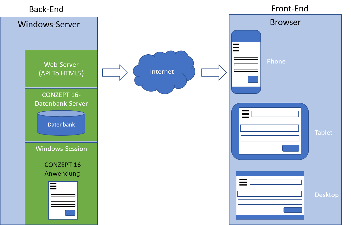
The back end of the mobile application is a Windows server. The conzept 16 database server runs on this server. The conzept 16 application is executed in a Windows session. The entire graphic output of the application is converted into HTML5 by a special web server. A device with an HTML5 browser is therefore sufficient as the front end of the mobile application.
Example application
The conversion from desktop to mobile is demonstrated using the order database, a sample application developed in conzept 16 with customer, article and order management.
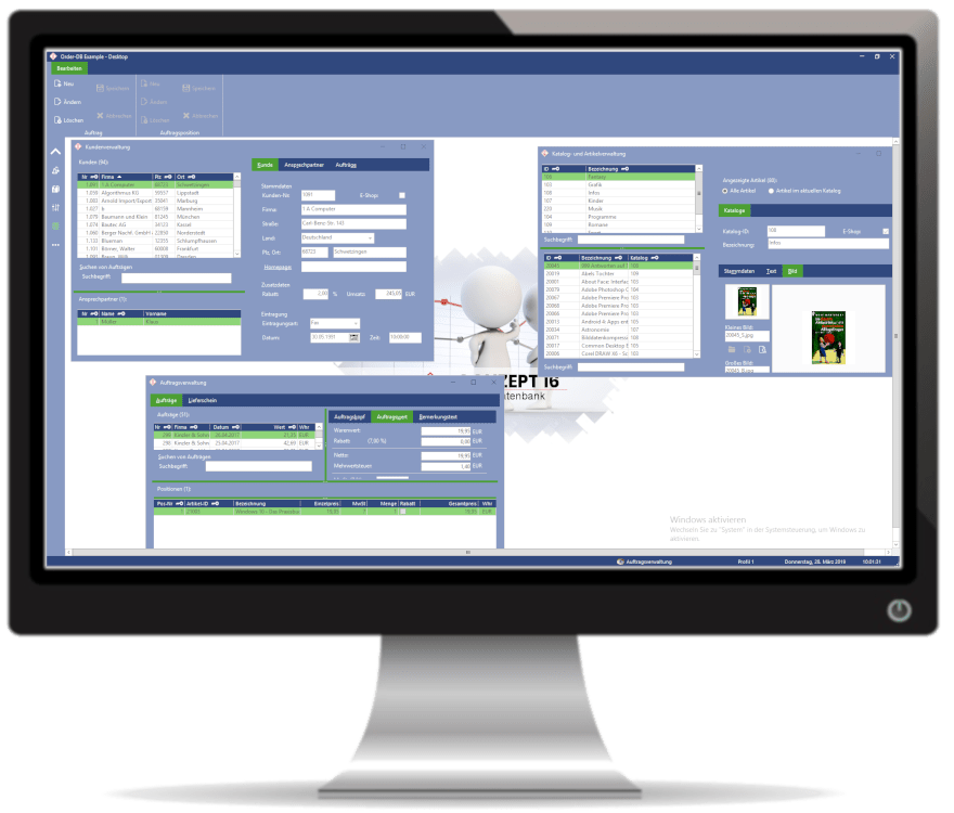
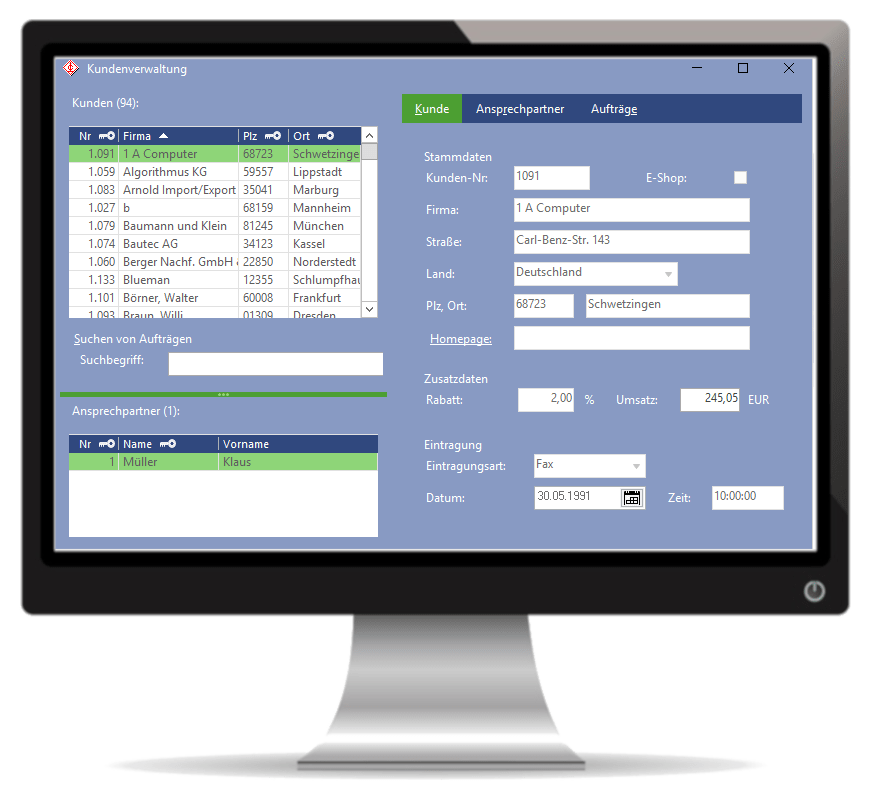
The aim is not to implement the full functionality of the desktop environment. Customer management is available (functionality of the “Customers” menu item), which we know from the desktop version (Fig. 2). This includes displaying and editing customers, as well as displaying the assigned orders and contact persons. Furthermore, a list of all customers can be printed out and files can be downloaded from the server.
When switching the interface from desktop to mobile, there are a few points to consider:
- Smaller display area
- Customising the layout structure
- Reduce the amount of information to the most important points
- Adjust sizes for touch operation
- Fonts
- Images
- Window
- Control elements
- Operability
- Mini tutorials
The new interface
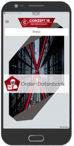
Similar to the desktop version, there is a start screen. It immediately stands out that the ribbon menu has been replaced by a burger menu (Fig. 3).
The desktop application (Fig. 4) displays customer management in MDI windows. The list of customers is on the left-hand side, the customer details are on the right-hand side. The contact persons are displayed below the customer list. This is obviously not suitable for the mobile version due to the space available.
The mobile version divides the interface into separate pages. These can be scrolled through using the button at the top. This allows the user to easily switch between customers, customer data and contact persons on the mobile device (Fig. 5).
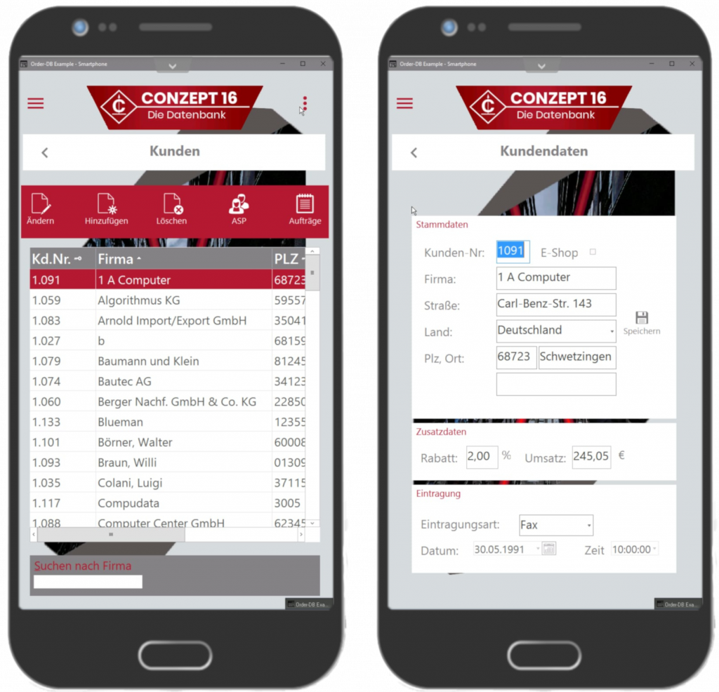
Navigation within the application is via the burger menu, context button and paging buttons.
Would you like to test the application yourself? Simply contact our sales department.